
Courtesy of Oatly
誰沒做過一夜成名走上人生巔峰的美夢呢?但有一家名叫Oatly的瑞典燕麥乳公司卻真的做到了。這家公司是由一位食品科學專業的教授創立的。此前20多年,它都只是植物飲料行業里一個籍籍無名的小字輩。但從幾年前開始,它的知名度突然暴漲,先是在歐洲搞出名堂,隨后在美國也火得一塌糊涂。仿佛一夜之間,到處都在談論這家公司,它甚至還上了《紐約時報》,對于一家2017年年初才登陸美國的公司,它的成績可以說相當了不起。
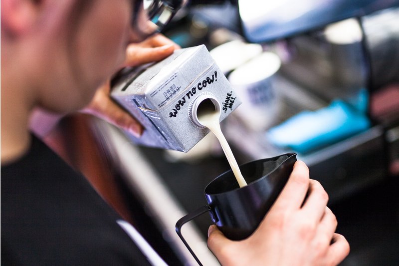
Oatly從一款默默無聞的產品躍升成一種文化現象,離不開幾個因素的共同推動。首先它的產品味道是相當不錯的(醇厚、飽滿是消費者對它的常見評價),另外植物奶市場總體上也呈增長態勢。但如果該公司五年前沒有對品牌進行重塑,恐怕今天知道它的人仍然不會太多。
2013年,該公司將約翰·斯庫克拉夫特任命為創意總監,負責為公司品牌形象注入新活力。當時斯庫克拉夫特對燕麥乳這種產品一無所知,該公司的產品包裝也沒有什么打動他的地方。“它沒有什么令人興奮之處,只是讓人感到很無趣,跟其他產品沒什么區別。”他回憶道。
斯庫克拉夫特與Oatly的CEO托尼·彼得森攜手瑞典知名營銷公司Forsman & Bodenfors,決心重新塑造新的品牌形象。他們認為,公司新的品牌審美應該回歸質樸。“我們希望給人造成一種感覺,就是這些產品仿佛是在地下室里包裝的一樣。總之,我們希望它看起來并不像一個企業的品牌或者Logo”。
包裝上的圖形是由F&B公司的設計師拉爾斯·埃爾夫曼手繪完成的。包裝上的文案則由斯庫克拉夫特親自操刀,最終的包裝頗有意識流的風格,同時又真誠而不做作地解釋了產品和公司的使命。
在對燕麥乳進行描述后,包裝上還印了一句口號:“它很像牛奶,不過是為人類制作的。”
[新聞原文]
You can call Oatly a 25-year-old overnight success story. Founded by a food science professor, the Swedish oat milk company spent decades as a niche player in the plant-based beverage industry. But a few years ago, its profile began to rise, first in Europe and now in the U.S. As if overnight, the company was being mentioned everywhere, including a buzzy feature in The New York Times. Not bad for a company who only fully entered the U.S. market in early 2017.
A number of factors helped facilitate Oatly’s ascent from obscure product to cultural phenomenon: the product is tasty (buttery and rich are common descriptors), and the overall plant-based milk sector is booming. But if not for a major rebranding five years ago, the company would likely still be flying under the radar.
In 2013, John Schoolcraft was brought on as creative director to breath new life into the look and feel of the company. Schoolcraft didn’t know anything about oat milk, and the company’s packaging didn’t do much to enlighten him. “It was uninspiring and boring,” he says. “It looked like everything else.”
Schoolcraft and Oatly CEO Toni Petersson worked with the Swedish agency Forsman & Bodenfors to overhaul the brand. The new aesthetic was deliberately unvarnished. “We wanted it to feel like we were making these packages in the basement,” Schoolcraft says. “The whole idea was for it to not look and feel like a corporate logo or brand.”
The type and images featured on the packaging were hand-drawn by Lars Elfman, a creative at Forsman & Bodenfors. Schoolcraft was responsible for coming up with the copy, which combined stream-of-consciousness musings with earnest but casual explanations of the product and the company’s mission.
“IT’S LIKE MILK BUT MADE FOR HUMANS,” reads one tagline, followed by a description of oat milk.(來源:財富中文網)
以上就是小公司如何塑造大品牌的相關資訊!關注財經365,獲取最優質的財經內容!